
Media grid

Steps:
In the theme editor (Customize), click Add section.
Locate Media grid
Make necessary changes. > Save.
General Settings

Width - With of this section 3 options : Boxed / Wide / Full
Subheading
Heading - Heading of this section
Heading size - From Heading 1 to Heading 6
Description - Description of this section
Layout - Horizontal / Vertical
Media grid settings

Desktop row height
Mobile row height
Column gap
Column count
In the Column count , you can configure up to 12 columns. This allows for a flexible layout—from a single-column structure to a grid divided into 12 equal parts.
Each child block inside the Column count is referred to as a Column, and you can configure each Column to span a specific number of columns within the Column count
If the Column count is set to 12 columns, you can have:
Column 1: 4 columns
Column 2: 4 columns
Column 3: 4 columns → Total = 12 (fills one row)
If the Column count is set to 4 columns, you can have:
Column A: 1 column
Column B: 3 columns → Total = 4 (fills one row)
Each Column block can be set to span from 1 to 12 columns, depending on the total number of columns defined in the Column count.
Always ensure that the total column span of all Column blocks in a row does not exceed the Grid's column count.
Columns will automatically wrap to a new row if the total exceeds the available space.
Colors
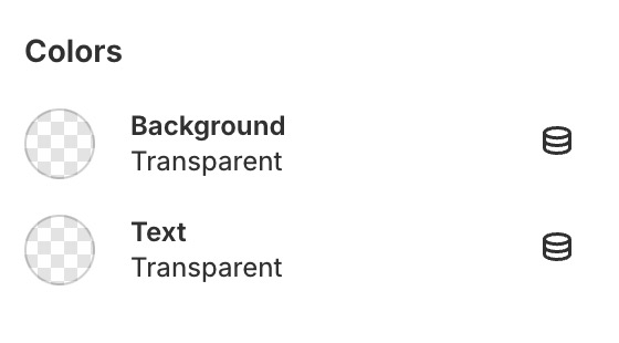
Background
Text color
Section padding
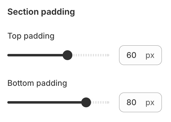
Top padding
Bottom padding
Block settings
Steps:
Locate Gallery grid.
Add Media.
Make necessary changes. > Save.


Last updated