
Product information
This section provides essential product information - such as price, title, buy buttons, etc.You can change the product information by re-ordering, removing, and adding more blocks.
How to add a Product information section?
Steps:
In the theme editor (Customize), open the template selector.
Select Products, then Default product.
On the left-sidebar, add Product information.
Make necessary changes > Save.
How to customize your Product information section
General Settings


Width - There are 3 options for with product information section: Boxed / Wide / Full
Enable sticky content on desktop - When you enable it, the product content will be fixed in position
Enable max width content product ⇒ Max width is 52rem
Show sticky add to cart bar - Display sticky add to cart bar on the product page.
Media
Learn more about media types.
Desktop media width - Set width for desktop media.
Image ratio - There are 4 options : Adapt to image / Square / Portrait / Landscape
Thumbnail ratio - There are 4 options : Adapt to image / Square / Portrait / Landscape
Desktop layout - There are 5 options : Stacked / Grid mix column / Grid 2 columns / Thumbnail left ( Carousel ) / Thumbnails bottom ( Carousel )
Desktop media position - Left / Right
Show Lightbox - Display zoom image when you click to image
Enable video autoplay - Grid mode, Stacked on desktop turn off autoplay.
Enable video looping - When enabled, the video will loop if the product has a video
Mobile layout - Show thumbnails / Hide thumbnails
Colors
Background
Text
Border
Section padding
Padding top
Padding bottom
Block settings
1. Text
Add the custom content you want

2. Link text
Display text or button has link

3. Title
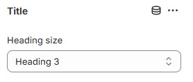
Display product title - You can edit size for title
4. Product rating

To display a rating, add a product rating app. Learn more
Target to section ⇒ When you click start it sroll to review section
How to Inspect a Website and Find the ID of an Element
Open your browser, such as Chrome, Edge, or Firefox.
Go to the website where you want to find the element ID.
Right-click on the element you want to inspect — this could be a button, image, heading, or any part of the page.
Click "Inspect" (or "Inspect Element").
The Developer Tools panel will open, and the selected element will be highlighted in the "Elements" tab.
Look at the HTML code for that element. For example:

👉 The ID here is judgeme_product_reviews
Currently, the ID shown in this example is for the Judge.me app,
However, if you're using a different review app, the ID may be different.
👉 If you're unable to find the correct ID, don’t worry — just reach out to our support team, and we’ll be happy to help you locate it!
5. Price
Display product price

6. Description
Display the product description.
7. Divider
Display border and spacing

8. SKU
Display SKU

9. Inventory status
Inventory status indicates product availability, essential for maintaining stock levels, managing inventory effectively, and updating customers about availability on your website.

10. Sibling products
Shopify allows you to use variants to offer multiple options for a single product. Although variants are highly versatile, they may fall short if you need to design significantly distinct pages for each variant.
Sibling products allow direct linking to other products as swatches, resulting in a detailed product page that features images representing each variant option.

Individual products
Each sibling is an individual product. Using custom metafields, The theme will connect these products together and auto-generate the swatch images.
Create individual products that are similar. Begin with the same name for each product to help maintain naming consistency for each sibling:
How to Set Up Sibling Products
Access:
On the left-sidebar, add Product information.
Click and access Sibling Products

Configure Picker Type
Set Up Show Siblings Sale Dot
Configure Option Name
Quick Setup (3 Steps)
Step 1: Create Metafields
What you need to create:
Color Metafield (stores the color name)
Go to: Settings → Custom data → Products → Add definition
Name:
Sibling ColorNamespace and key:
custom.sibling_colorType: Single line text
Click Save

Siblings List Metafield (stores related products)
Go to: Settings → Custom data → Products → Add definition
Name:
SiblingsNamespace and key:
custom.siblingsType: List of products
Click Save

Step 2: Add Values to Your Products
For each product in your sibling group:
Open the product edit page
Scroll down to find the Metafields section
Fill in:
Sibling Color: Enter the color name (e.g., "Black Oiled")
Siblings: Select all related products (including this product itself)
Example: For Black sandals:
Sibling Color:
Black OiledSiblings: Select Black sandals, Brown sandals, Tan sandals, Gray sandals

Step 3: Configure in Theme Editor
On the left-sidebar, add Product information.
Click and access Sibling Products
Picker type:
Choose
Product image / Block / Color Swatch
Option name:
Content:
Color:
Option value metafield:
Content:
custom.sibling_color
Siblings products metafield:
Content:
custom.siblings

11. Variant picker
Products with variants provide customers with more choices. To learn more about variants and how to add them to your store, visit the following link.

Picker type - Dropdown / Block
Hide sold out variants
Color picker type - Block / Dropdown / Color swatch / Variant image
Block type - Outline / Solid
Option name - When variant product has option name will be show popup size chart
Size chart page - Display size chart from page. You can also create a different size chart for each product using metafeild
12. Quantity selector
Allows customers to increase or decrease quantity
Enable quantity rules
13. Buy buttons

Show 2 columns
Show dynamic checkout buttons
Show recipient information form for gift cards
Show pickup availability
Show back in stock notification
Text back in stock
14. Rich text
A featured block allows you to promote your content

15. Complementary products
To select complementary products, add the Search & Discovery app. Learn more

16. Icon with text


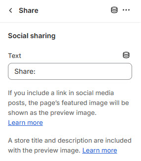
17. Share
The option to display social networks for sharing or copying links to share.
18. Trust badge
Display image or payment gateway logo on the product page. Help customer to trust your store.

19. Countdown timer
Display the promotion countdown.
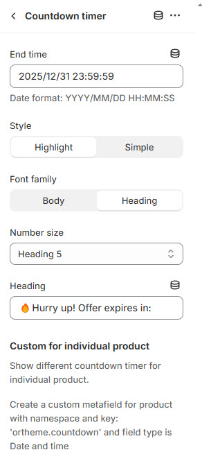
Create a custom metafield for product with namespace and key: 'ortheme.countdown' and field type is Date and time
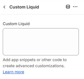
20. Custom Liquid
Add app snippets or other Liquid code to create advanced customizations.
21. Pop-up

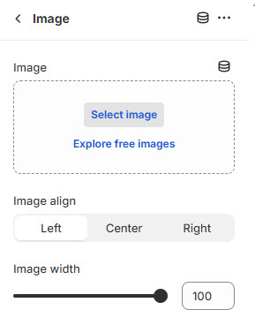
22. Image
Display image on the product page.
23. Custom option
Custom option are used to collect customization information for an item added to the cart. This information can be collected from the buyer on the product page.
There are 4 options : Text / Textarea / Dropdown / Radio

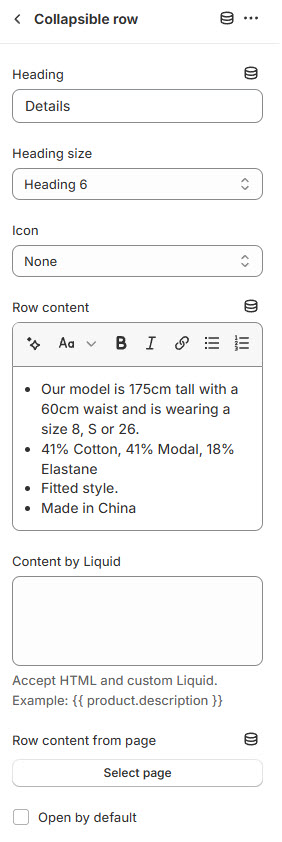
24. Collapsible row
Add a heading and extra information on the tabs.
25. Fit guide

26. Breadcrumbs

Last updated